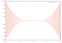
 Gnuplot is a powerful, simple and easy-to-learn OpenSource plotting-tool. That should be enough information to make Gnuplot your favorite function plotter.
Plots become even nicer, if Gnuplot is used together with a typsetting system which is made for producing high quality documents such as (La)TeX. Tikz/pgf resp. pgfplots offers an easy method accessing Gnuplot via shell-escape. While tikz and pgfplots also offer a function calculation though TeX, TeX isn´t made for such calculations since the accuracy isn´t that high. Float arithmetics aren´t part of the TeX Kernel so float calculation is quite difficult in TeX.
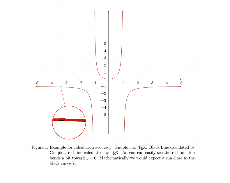
The following (tiny) example shows 2 aspects: 1. an calculation-/plotting lapse is occurring in the TeX-made calculation and 2. tikz/pgf (plots) produces exceptional beautiful graphs.
I used pgfplots for the function and the spy method directly from tikz.
I believe it is obvious: the red curve (TeX) behaves unexpected in comparison to the black curve (Gnuplot).
Conclusion? Let Gnuplot calculate functions. Its made for that. TeX however is made for producing almost perfect (pdf-) documents. If you use ever ytool according to its very own purpose , you´ll get an perfect result.
\documentclass{scrartcl} \usepackage[english]{babel} \usepackage[latin1]{inputenc} \renewcommand{\thepage}{} \usepackage{pgfplots} \usepackage{tikz} \usetikzlibrary{spy} % Zoom \begin{document} \begin{figure} \begin{tikzpicture}[spy using outlines={circle, magnification=15, size=3cm, connect spies}] \begin{scope} \begin{axis}[ width=\textwidth,domain=-5:5, % restrict y to domain=-10:10, % axis x line=center, axis y line=center,% xtick={-5,...,5}, ytick={-5,...,5} ] \addplot[mark=none, color=black] plot gnuplot[samples=500,id=eins]{x^2/(1-x^2)}; \addplot[mark=none, color=red] plot[samples=500,smooth]{x^2/(1-x^2)}; % ohne gnuplot \end{axis} \spy [red] on (2.25,4.2) in node at (3,1); \end{scope} \end{tikzpicture} \caption{Example for calculation accuracy: Gnuplot vs. \TeX . Black Line calculated by Gnuplot, red line calculated by \TeX . As you can easily see the red function bends a bit toward $y=0$. Mathematically we would expect a run close to the black curve´s. That behavior seems not to be symmetric. } \end{figure} \end{document} |
Links
Some more examples for pgfplots on golatex.de (german).
Unique collection of tikz examples texample.net.
